最近重温了下Flex,发现不用的话很快就会忘记,所以除了用传统的笔记外,再在blog上敲一下加深下印象。 :)
一个弹性盒布局是这样的:
W3C上给出的图片:

个人感觉MDN给的图片看着更清楚:

1 兼容性
a. IE 8,9都不支持,10是要写 display: flexbox;
b. Chrome 20- / Safari 3.1+ / Firefox 2-21 / Android 2.1+ / iOS 3.2+ 都是09年旧的语法,需要写 display: box;
c. Chrome 21+ / Safari 6.1+ / Opera 12.1+ / IE 11+ / Android 4.4+ / iOS 7.1+ 都可采用新的 display: flex;
2 Flex Container
display: flex | inline-flex;
flex-direction: row | row-reverse | column | column-reverse;flex-wrap: nowrap | wrap | wrap-reverse;flex-flow: <'flex-direction'> || <'flex-wrap'>;


justify-content: flex-start | flex-end | center | space-between | space-around;align-content: flex-start | flex-end | center | space-between | space-around | stretch;align-items: flex-start | flex-end | center | baseline | stretch;


3 Flex items
order: 'integer';
align-self: auto | flex-start | flex-end | center | baseline | stretch;

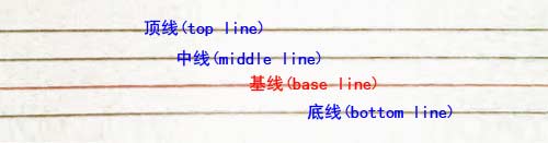
关于Baseline:
flex-grow: 'number'; /* default 0 */

flex-shrink: 'number'; /* default 1 */
根据需要用来定义伸缩项目收缩的能力。[注意:负值同样生效。]
flex-basis: 'length' | auto; /* default auto */

flex: none | [<'flex-grow'> <'flex-shrink'> ?|| <'flex-basis'>] /* default: 0 1 auto */
相关资料: